Designing a logo that which not only communicates the relevance and functions of an organization but also the effects of contributions of the masses helping the world. A symbol that is remembered for a purpose and strings the cords of the viewer’s minds corresponding growth, care, friendship, nurture and core human values.
Most images used for a non-profit organization involve a group of hands around the globe or the same cliché monotonously suggesting team work and growth for a cause. The use of these images deliver the message a 100% no doubt. But in order for an organization to prosper, it has to be unique, different, distinguished from the others. The goal no matter if its environmental, wildlife or human values is the same- Conservation, togetherness, education so on and so forth. In order to have that different feel and touch to your organization your logo can reach out to those who know about the organizations with globes and a tree with a planet in between. A community and non-profit logo design for each designer should be considered as a “new-path” and a new logo rather than instilling the same images of peace with a “V” sign or a white pigeon.
After all different images would conclude to the same meaning if depicted accurately:

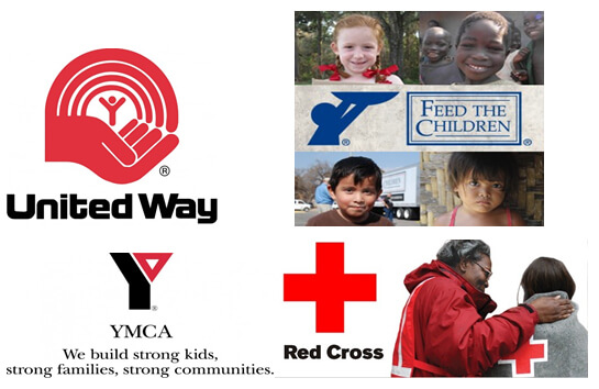
 These Community and Non Profit Logo Designs are considered to be the worlds largest organizations for raising funds, educational awareness and supporting famine struck countries. Their logo does all the talking. For example the “Feed the Children” logo depicts a small kid with a plate, raising his hands for food. The aura that surrounds the logo would manage to convey, melt the viewers heart for the cause and donate. It is, what its displaying – A community and non profit logo design has to be simple, unique and professional to correspond accordingly.
Community and Non-Profit Logo Design- Images Fonts & Colours
Images peculiarly used in the non-profit organization logs should be elemental. One must be able to explain what, how, where and why’s of the logo almost immediately at a glance. For example the Comfort Zone Home Care logo with a palm inside a house with 3 people streaming out with hands raised in joy for health care and old age home is a good example.
A Community and Non-Profit Logo Design has to be competent and transparent. Anything bold or flashy may give the wrong ideas about your organization. Using typography or 2 words to describe your image should be just perfect. Colours of blue and white are most commonly used to depict peace, growth and care. However other colours such as red, black and green show emergency in a cause and can lead your target audience to do the needful almost immediately.
This is one industry that the logo matters the most, when designing or envisioning a logo for your non-profit organization, maintaining one thing would lead to a unique and memorable design- Happiness is in giving and sharing than that of procuring and bearing- Unknown.

Community and Non-Profit Organization Logo Design – Approach
Your designer must be able to incorporate images for a direct approach to what you have to offer in your logo. For example if its environment related or plantation of trees for oxidation, then an image should be able to communicate the same. The more simple your logo, the better the comprehension of your target audience.
Ask yourself a few question when revamping your existing design or setting a new Community and Non-Profit Logo Design:
- Is it unique?
- Can you explain what message the image or images convey in your logo?
- Does your logo orate a tale when looked at?
- Is it simple?
These questions can help any designer or owner of a non-profit organization attain that everlasting memorable logo design. Let us know what logos you like that which are heart-warming and telling tale when it comes to a non-profit organization.


